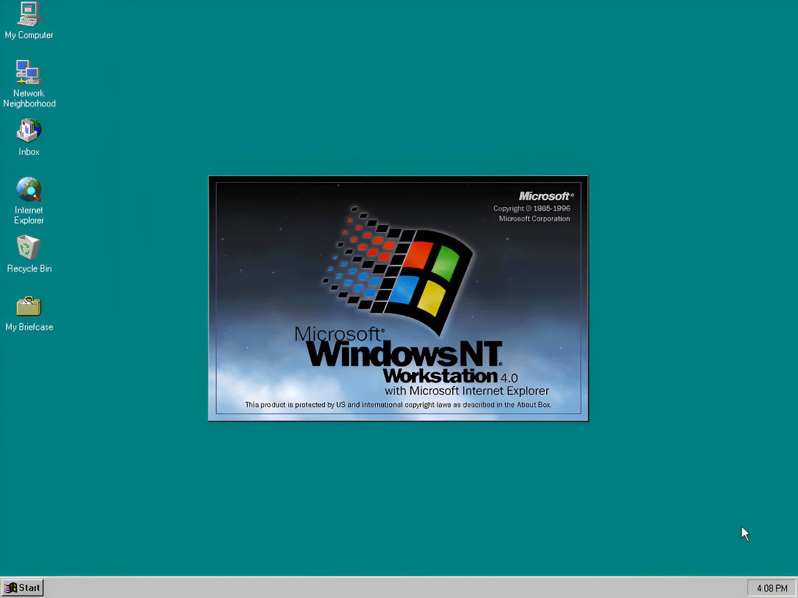
In context: If you were a Windows user in the ’90s, you’re likely to be intimately familiar with the iconic Start Menu that shipped with Windows NT. That signature vertical banner proclaiming “Windows NT Workstation,” or whichever variant you were running, is an image seared into the minds of many PC users from the era, and we have programmer Dave Plummer to thank for bringing the branding element to life.
In a post on X/Twitter, the Windows veteran pulled back the curtain on just how that Start Menu banner came to be, highlighting both the cleverness of his solution and the technical constraints of building software in the ’90s.
The key issue was that Windows NT had multiple SKUs – server, workstation, and the like – across various languages. Doing unique bitmapped banners for each permutation would have been difficult and more resource-heavy. So Plummer decided to work around this by rendering that banner text and gradient live with code.
The idea may sound straightforward today, but sideways text rendering was no piece of cake in the days before modern web technologies. Thankfully, as Plummer recounts, Windows NT introduced the ability to rotate the device context – a capability its Windows 9x predecessor lacked. This allowed him to use standard system fonts, rotating the context 90 degrees to achieve that iconic vertical text layout.
If I had a LinkedIn bio, I’d definitely mention that I wrote the Windows Start Menu.
Well, the non-resume version is that I wrote the code that custom-paints the Start menu, draws the sideways text, background gradient, and so on. It had been done with a Bitmap in Windows 95,… pic.twitter.com/QgQqhSFi8w
– Dave W Plummer (@davepl1968) July 14, 2024
The background gradient effect mimicking the blue-to-black color transition on Windows NT’s packaging was another piece Plummer cleverly rendered live using standard GDI calls.
“I used standard GDI calls to render the background gradient, which fades blue-black like the sky on the NT box, then fill anything past that with solid black,” he wrote.
The result was a clean, scalable banner perfectly matched to the operating system’s distinct visual identity.
Plummer admits he was still green when tasked with the Start Menu code. “I’d only been coding for Windows a few months at that point, so it was cool to discover it was even possible,” he recalled.
When asked if graphics designers were involved, Plummer stated he did not recall their participation, and that he merely replicated the Windows 95 designers’ vision programmatically for NT. He wasn’t sure if matching the NT box art was his call or a designer’s, but said graphic design was not in his lane.
Speaking of graphics, this method did have one quirky drawback. One commenter lamented the loss of an old trick where users could swap the static bitmap with custom artwork. To that, Plummer responded that replacing the banner with “tall, skinny porn” used to be a thing.


